Unbreakable Brands, Unstoppable Growth
Professional Eye Care
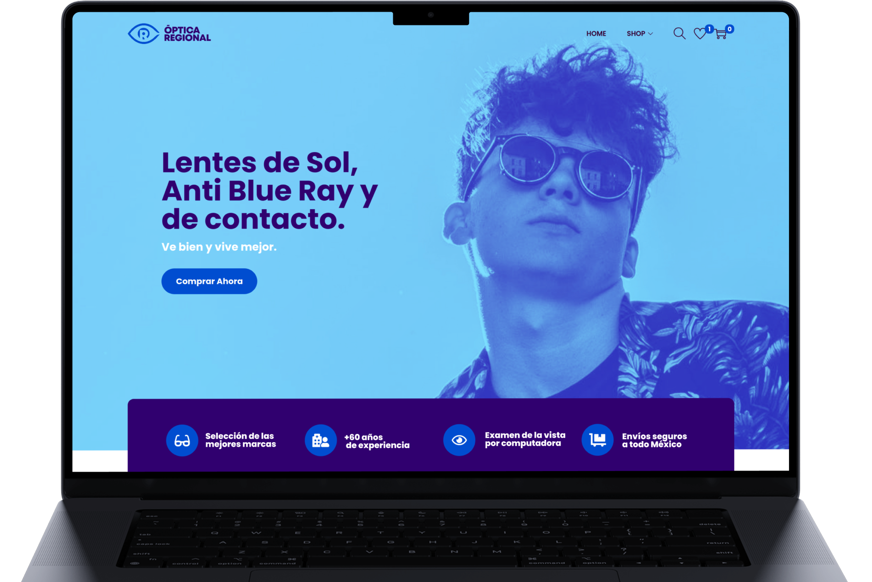
Óptica Regional
Óptica Regional is a trusted optometry practice located in Monterrey, NL, Mexico. They are committed to delivering exceptional eye care and personalized attention.


The Challenge
Preserve the “R” within the eye concept while refining the mark into a sharper, more contemporary system—youthful and modern, without sacrificing legibility or brand authority.
[ MAIN LOGO ]

[ VARIANT ]

[ ICON ]

[ PRIMARY COLOR ]
Charlotte Blue
#004DD0
[ SECONDARY COLOR ]
Deep Violet
#30006F
[ TERTIARY COLOR ]
Spicy Blue
#53C7FA
[ QUATERNARY COLOR ]
Full White
#FFFFFF

[ BEFORE ]

[ AFTER ]
Óptica Regional carried years of brand equity in its original mark. The challenge was to evolve it — not replace it. The refreshed identity brings a younger, more contemporary energy while keeping the visual DNA that made the brand recognizable in the first place.
[ NEXT CASE ]
Estudio RST